Real Eyes Optometry
Brand Development, Copywriting, Consulting, Website Development

Backstory
Real Eyes Optometry has been one of my biggest projects- the opportunity to build a brand from scratch.
By any other name
First things first, we needed a name, and we needed something catchy.
The client was opening a new optometry practice in Metropolis at Metrotown, the largest mall in BC, and they wanted a unique name that stood out from the other local optometry clinics, many of which were simply named after the optometrist or used the name of the mall in some way (ie. “Metropolis Eyecare”).
We needed a way to immediately differentiate ourselves, and I thought a clever name could really catch people’s eyes.
After trying to incorporate “wink” or “blink” into an interesting optometric name, it came to me out of the blue:
“Real Eyes”
I initially suggested "Real Eyes Eyecare" because of the double meaning of "realize I care", which I thought integrated the doctor’s patient-centred approach, but the client preferred "optometry" because it sounded more professional.
Building a team
Now that we had a name, we needed a logo and website. While I could take care of all the content and copy needs, I needed some help with the graphic design and website build and luckily, I knew exactly who to call.
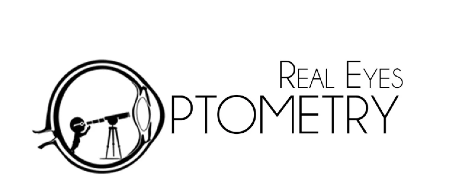
Visualizing logos
I introduced the client to my graphic designer colleague at a local Starbucks where we brainstormed logo concepts and talked about the Real Eyes brand image and how the logo needed to fit into that. The official logo is on your right.
My biggest contribution to the logo was the suggestion to use an eye as the first “O” in "optometry", but I also suggested giving the child inside the eye a pair of glasses.